Sales management dashboard
Redesigning the sales management legacy application for Biz Buddy, Reliance’s internal task and team management platform for sales managers.
Impact: Increase in user engagement by 30% , Report generation time improved by 65%
ROLE
Product Designer
TEAM
1 Product Designers | 2 Developers | 1 Product Manager | 1 Design lead
TOOLS
Figma. FigJam, Maze
It is an internal sales management application used by the sales managers of Reliance Retail to Track sales targets, Monitor team’s performance, tasks, and attendance, Log field visits, Track their incentives
What is BizBuddy?
Biz Buddy was intended as an all-in-one application for its sales employees to track performance data, manage leads and perform tasks. However, with outdated content, an overwhelming interface, and a lack of engagement features, it was clear that the platform needed a comprehensive redesign.
My challenge was to rethink the Homepage and team management journey for the sales team at all levels to:
Increase employee engagement.
Strengthen the sense of community within the organization.
Streamline access to critical information, reducing unnecessary clicks and improving efficiency.
Overview
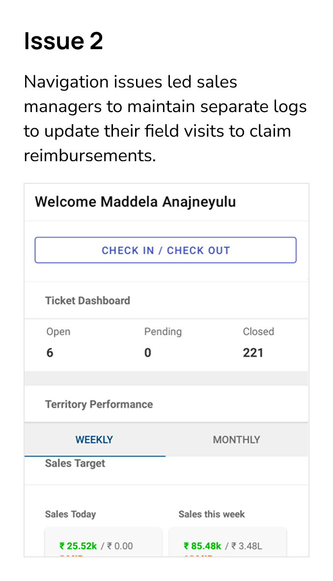
Biz Buddy struggled with low adoption because it lacked key features and was hard to use. Only field officers used it, mainly for basic tasks. Poor communication made it hard for leaders to track the team’s performance. Complicated navigation slowed things down, and outdated content pushed teams to use Excel and WhatsApp instead.
Problem
After several brainstorming sessions with the internal team and synthesizing raw data through affinity mapping, we identified three key themes to address.
Designs
❌ No real-time updates, making users doubt the data’s accuracy.
❌ No visibility into team performance, forcing users to rely on Excel.
❌ New users are confused about clickable features, leading to usability issues.
Old Homepage
✔️ Added ‘last updated’ timestamp to enhance trust and data transparency.
✔️ Provided quick access to team metrics, reducing cognitive load
✔️ Introduced text labels and card-style UI for better usability
✔️ Enhanced team listing cards for a quick L1-stage overview at a glance.
New Homepage
Old Homepage
❌ The biggest struggle users faced in the dashboard was no real-time updates, which resulted in a lack of trust in the data.
❌ There was no feature to dive into the individual performance of the team members, which lead to using alternatives like excel sheets.
❌ Dashboard’s interface was confusing and new users struggled to understand of clickability of features
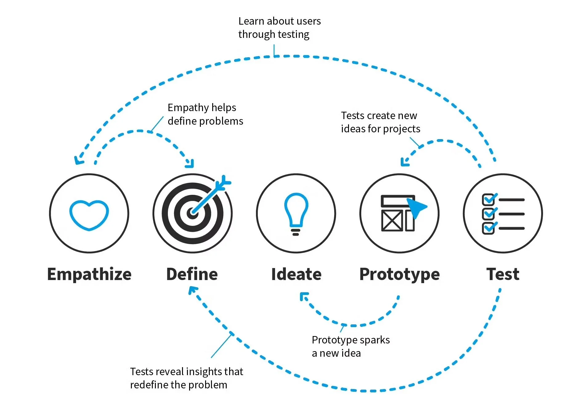
Process
I adopted a Non-Linear Design Thinking Approach to address the challenges faced by our target users, as this methodology allows for flexibility, continuous iteration, and deeper empathy.
Research
To better understand how sales employees navigate, I kicked off my project with a deep dive into understanding the challenges faced by them. I started my with primary research, outlining the key insights we needed:
Essential performance metrics required for different employee groups.
Challenges employees faced when using Biz Buddy.
Existing communication patterns and how information was shared internally.
Key Insights
To better understand how sales employees navigate, I kicked off my project with a deep dive into understanding the challenges faced by them. I started my with primary research, outlining the key insights we needed:
Essential performance metrics required for different employee groups.
Challenges employees faced when using Biz Buddy.
Existing communication patterns and how information was shared internally.


HOW MIGHT WERedesign the Biz Buddy to be more engaging, community-driven, and intuitive, ensuring that employees find value in using it daily?
Ideation and Iterations
The required features, call to action and pieces of information were pretty clear after the phases above. Moreover, the information architecture was fixed after the initial research. Hence i directly moved on to wire-framing for both the screens
After a couple of iterations, when I got a general idea ready, i did a couple of rounds of design feedback with my design colleagues, lead and product manger. We used voting method to identify more useable features.
I managed the end-to-end developer handoff for BizBuddy, documenting detailed notes to guide the MVP implementation and ensure a smooth, accurate transfer. This helped the development team assess the feasibility of the redesigned screens.
Developer Handoff
Final Screens
0 → 1
The final screens were carefully checked and found to be ready for development. They were approved for implementation to match project goals and user needs. I redesigned the image upload process, property grid/list view, and settings page, as well as the login/sign-up page.
Dashboard - first fold

Data Filter

Dashboard - last fold

Retailer Listing

Team member Profile page

L2 level of metrics

ℹ️ Some parts of the project’s concepts and the process are under a Non-Disclosure Agreement (NDA). I have used dummy data on all of the screens to protect the confidentiality of the content. All the work belongs to the respective companies and should not be copied or recreated in any manner.
Impact
30% increase in user engagement, measured via Adobe Analytics through session durations, daily active users, and task completion rates (compared to 15% engagement in the legacy system).
Automated task planning saved 2 hours per TSM daily, totalling 40 hours of manual effort saved per month per manager, which equates to 1,200+ hours saved across all TSMs monthly., totalling 50 hours of manual effort saved per month per manager, which equates to 1,500+ hours saved across all TSMs monthly.
Report generation time improved by 30%, cutting down processing time from an average of 20 minutes per report to 8 minutes.
Learning and Takeways
Data-Driven UX: Incorporating insights from user research simplifies the visual design process by prioritizing needs and pinpointing pain points effectively.
Balancing Research and Design in a Timeframe: Achieving equilibrium between research and visual design is crucial for creating user-centric designs. Both elements play equally significant roles in the design process.
Avoiding Assumptions: Validating assumptions is essential in UX design. User problems may differ from initial assumptions, emphasizing the importance of gathering concrete user feedback to inform design decisions accurately.